Golden Hour
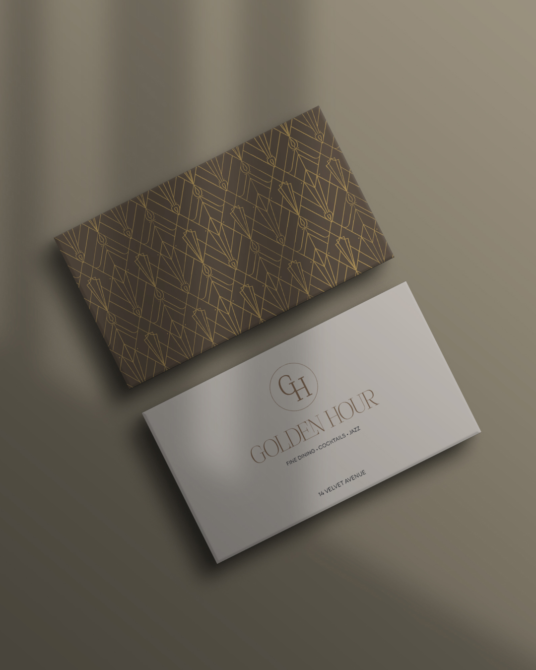
A logo and identity for a modern European dining concept — Art Deco geometry and quiet glamour, reinterpreted through a contemporary lens for a restaurant where atmosphere and detail arrive at the right moment.
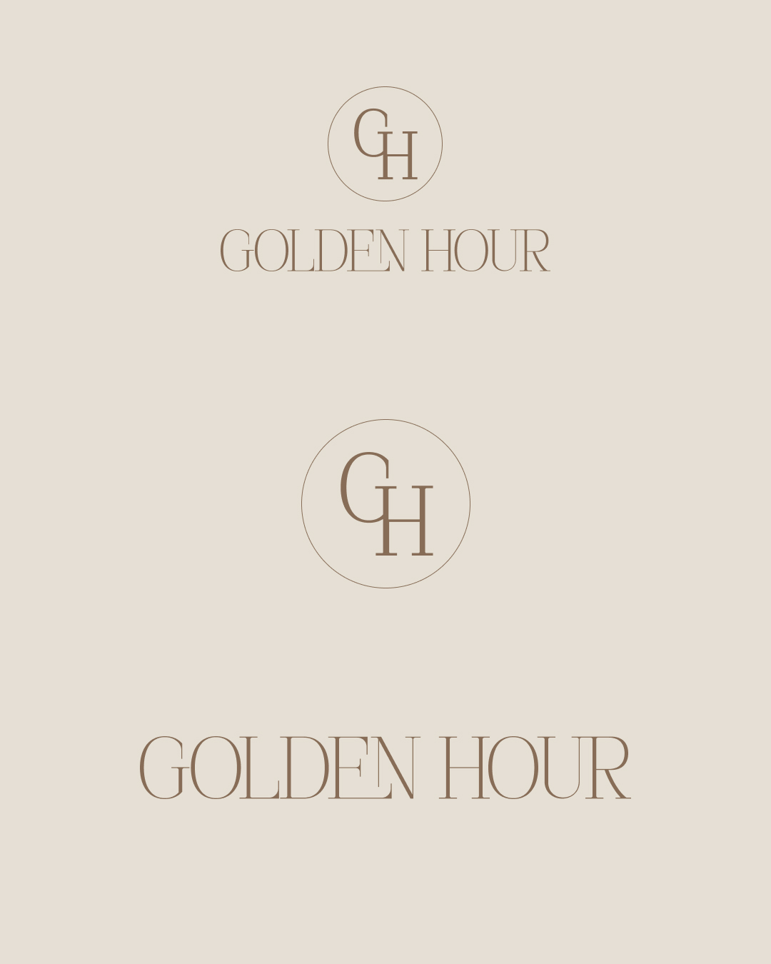
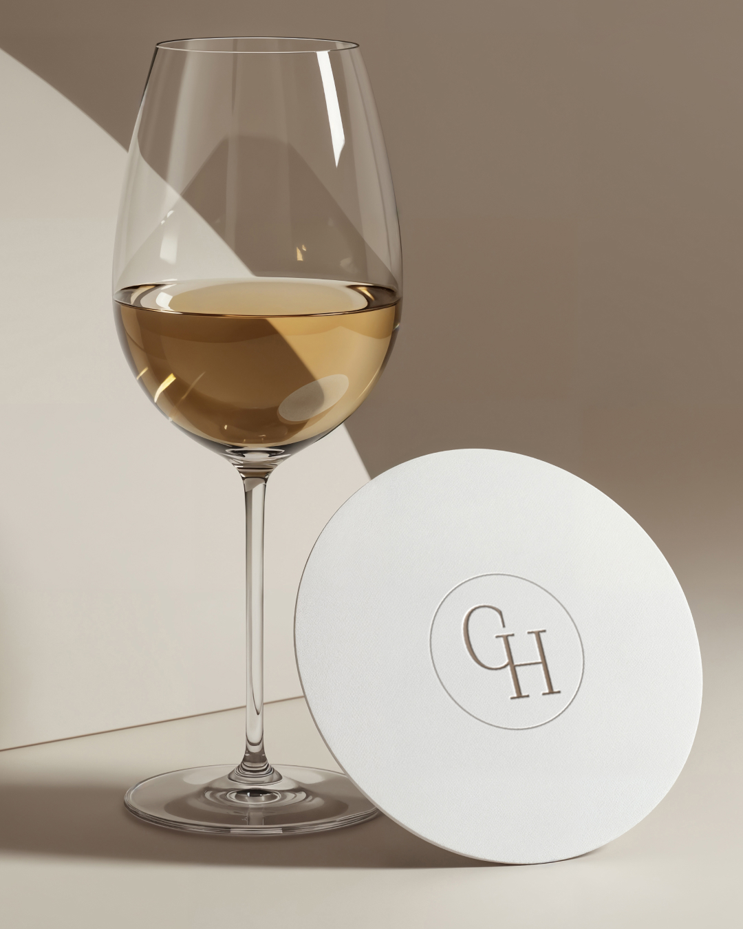
The logo for Golden Hour draws from the refined geometry and quiet glamour of Art Deco — reinterpreted through a contemporary lens. Rather than nostalgia, the mark distils the movement’s essence: symmetry, balance, and elegance, reshaped for a modern dining experience.
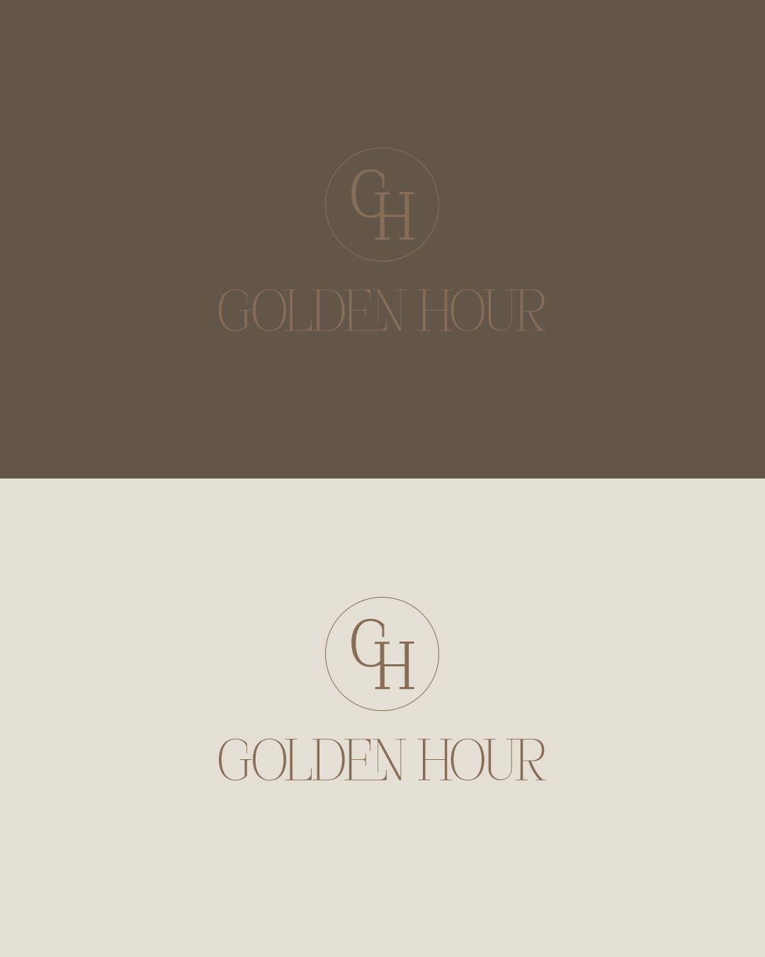
At its core, the identity reflects a distinctly European sensibility. References to Art Deco architecture and typography live in the letterforms — where clean lines meet gentle curves, creating a rhythm that feels both classic and current.
Each element is carefully considered. Proportion and detail speak instead of ornament. The result is a logo that feels composed and intentional — warm and sophisticated, never competing with the experience it belongs to.
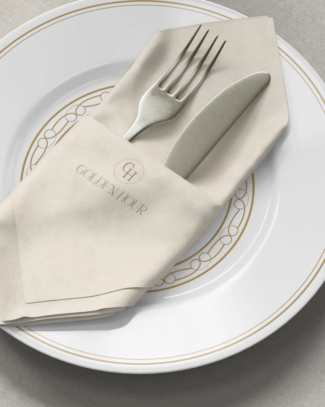
Designed to live across menus, signage, and digital touchpoints, the identity adapts with ease — much like the restaurant itself: atmosphere, detail, and design arriving at precisely the right moment.