
Ceramo
A logo and identity for a ceramic studio — rooted in material honesty and quiet craftsmanship, balancing softness and structure to reflect the dialogue between hand and form.
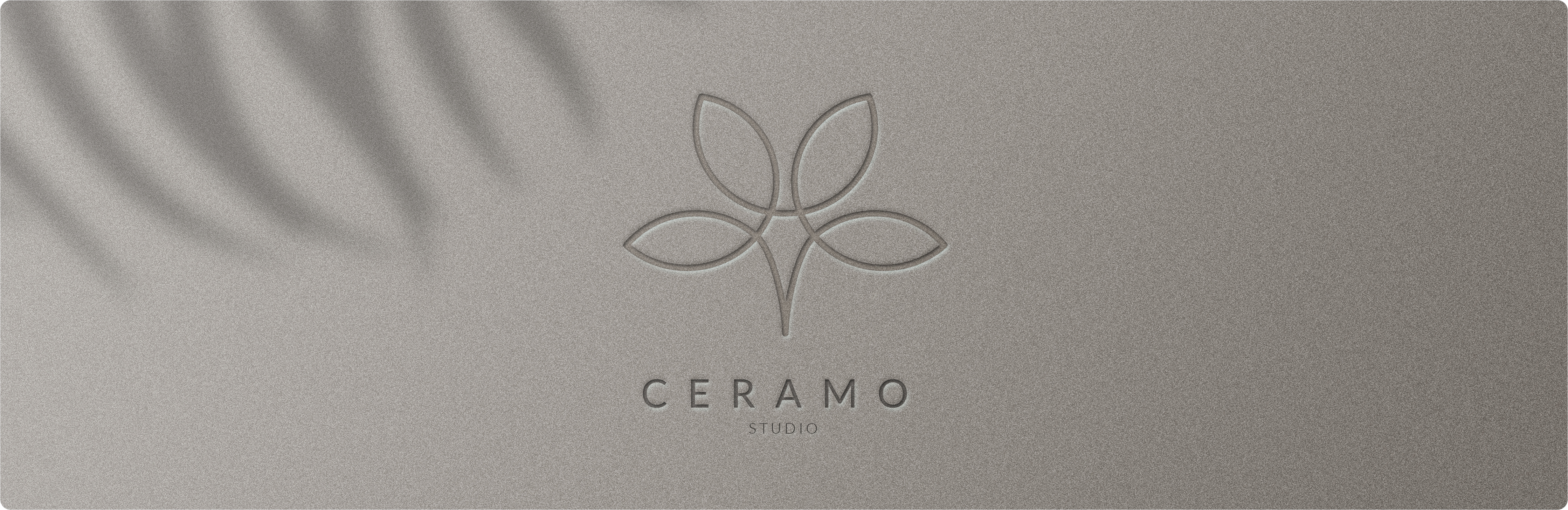
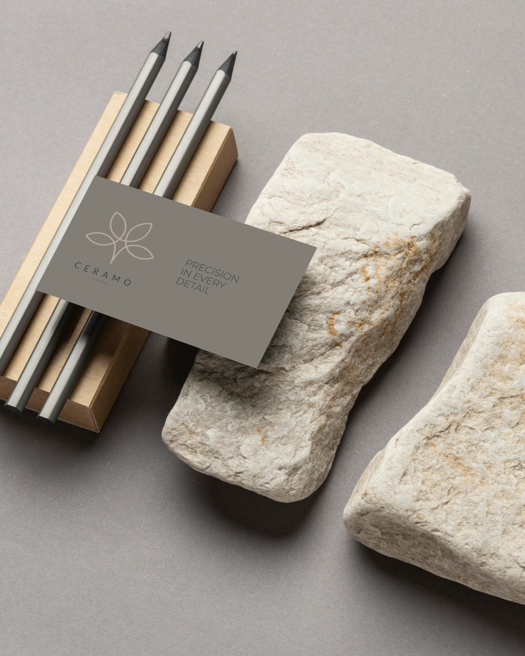
The logo design for Ceramo Studio is rooted in material honesty and quiet craftsmanship. Inspired by the tactile nature of clay and the discipline of ceramic making, the mark balances softness and structure — reflecting the dialogue between hand and form.
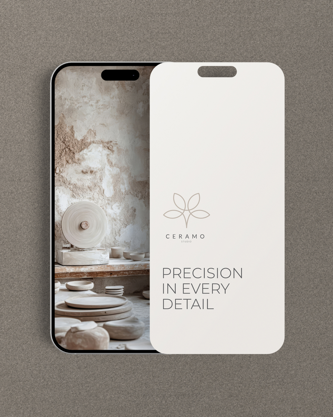
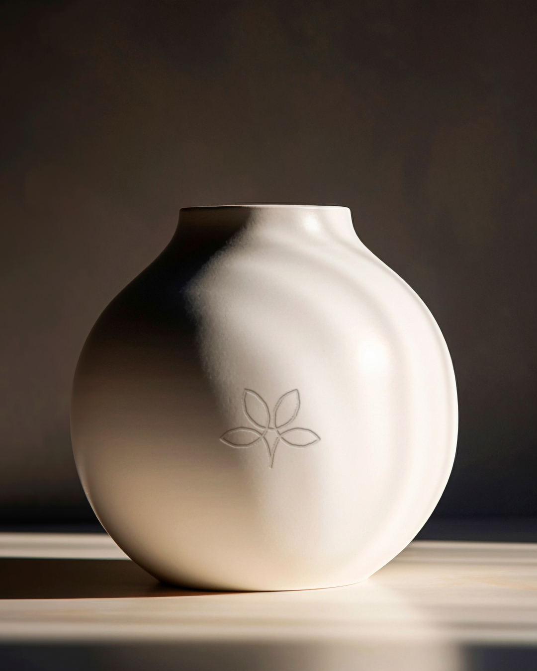
Construction is minimal and deliberate. Subtle curves echo the organic imperfections of ceramics, while the overall geometry stays controlled and precise. The contrast creates a visual language that feels grounded, refined, and unhurried.
Typography is understated — it lets texture and proportion carry the identity, no excess, only intention. The logo holds across physical and digital applications equally: studio signage, packaging, stamps, and documentation.
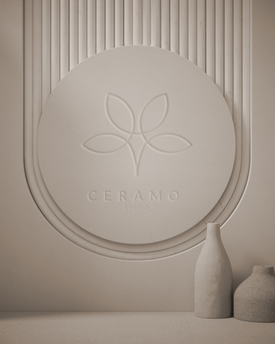
It doesn’t seek attention — it earns it, through balance, restraint, and material awareness. An identity designed to be felt as much as it is seen.